


Virtus – reinventing a brand with small but high-impact changes.
What we did
Brand Refresh
Photography
Capability Statement
Industry
Civil Engineering
Location
Sydney
Virtus had grown quickly from 13 to 80+ construction staff and labourers and needed a more refined identity to support Tier 1 and government opportunities. We refreshed the brand by simplifying the brand’s existing phoenix icon, shifting focus to a single feather motif that looked cleaner and avoided the wrong industry associations. That move helped create a stronger visual system while reinforcing Virtus’ ability to bring smart, simple solutions to complex infrastructure challenges.
2024
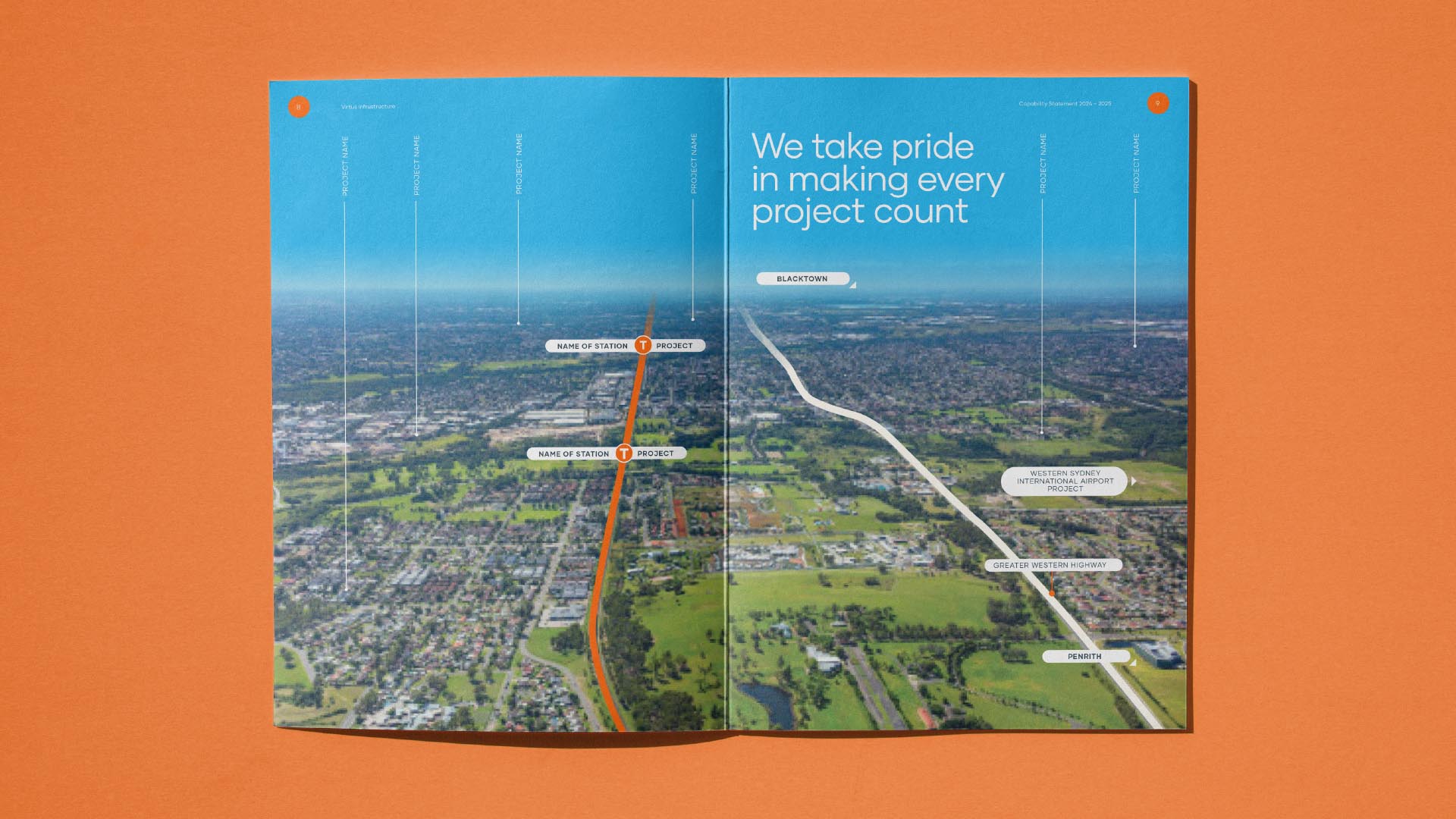
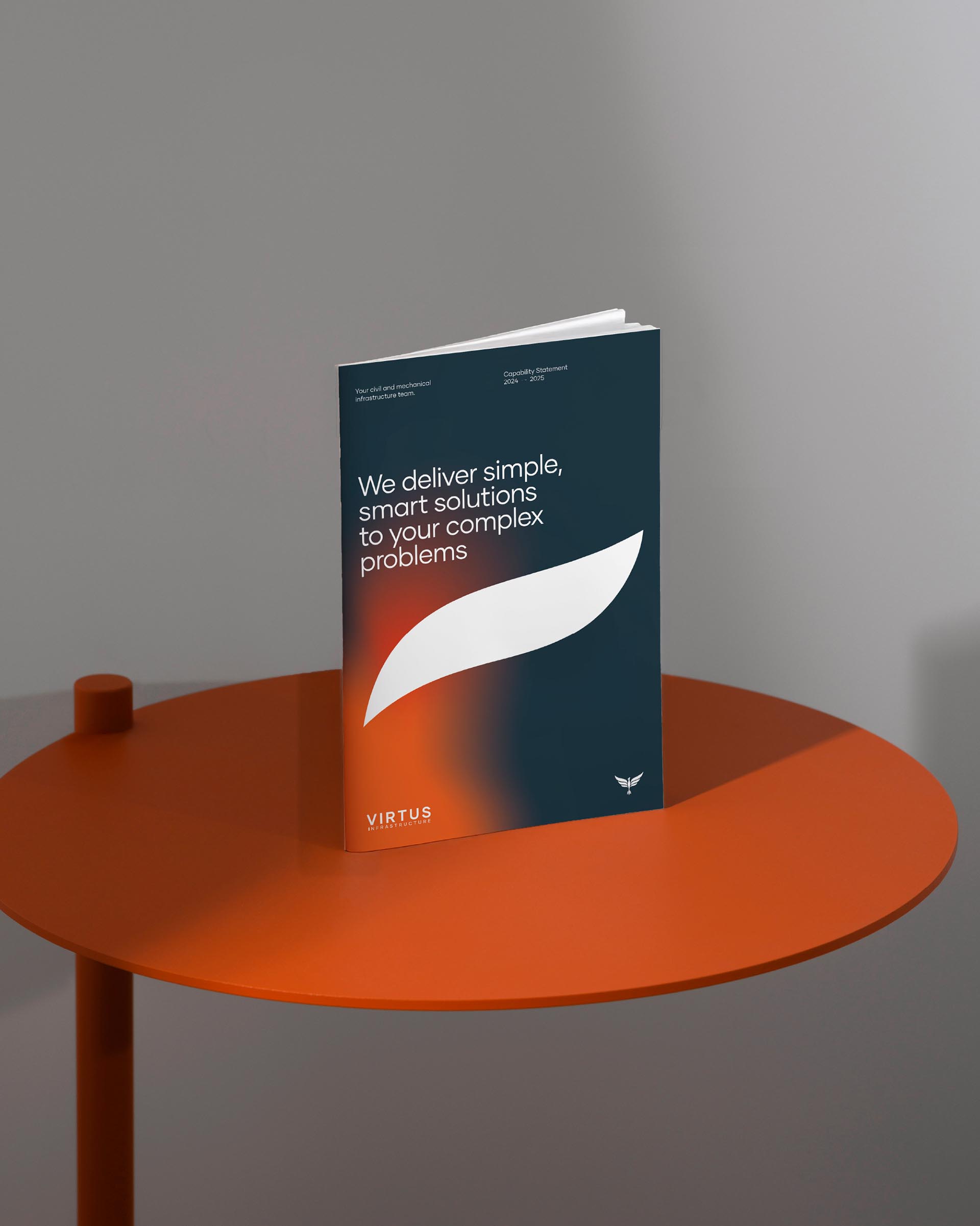
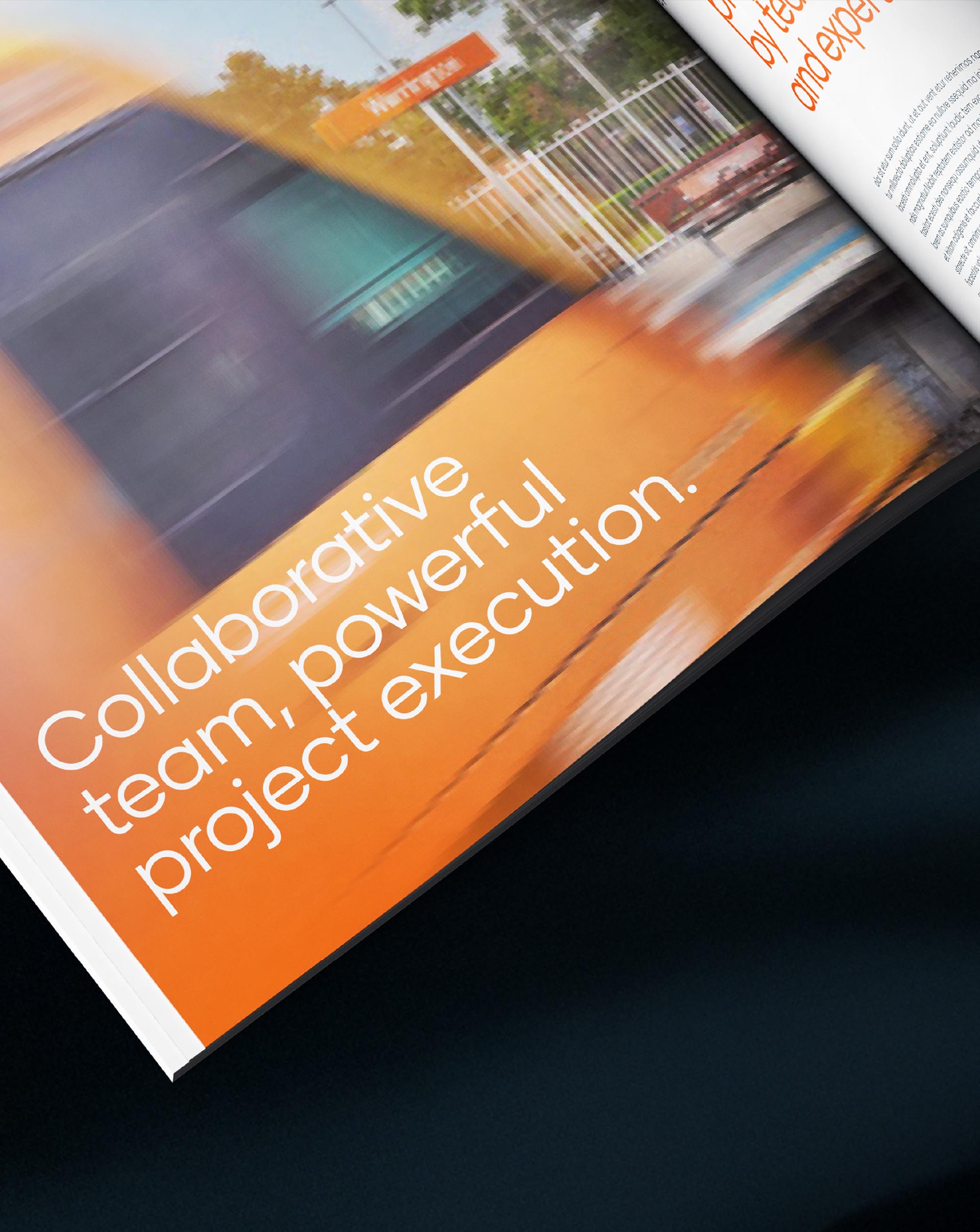
By narrowing the identity to a single feather, we created a more ownable visual mark that reduced noise, improved recognition and aligned with the brand’s promise of solving complexity with clarity. From there, we applied the refreshed visual language across the capability statement designed to feel professional, innovative and highly resolved.
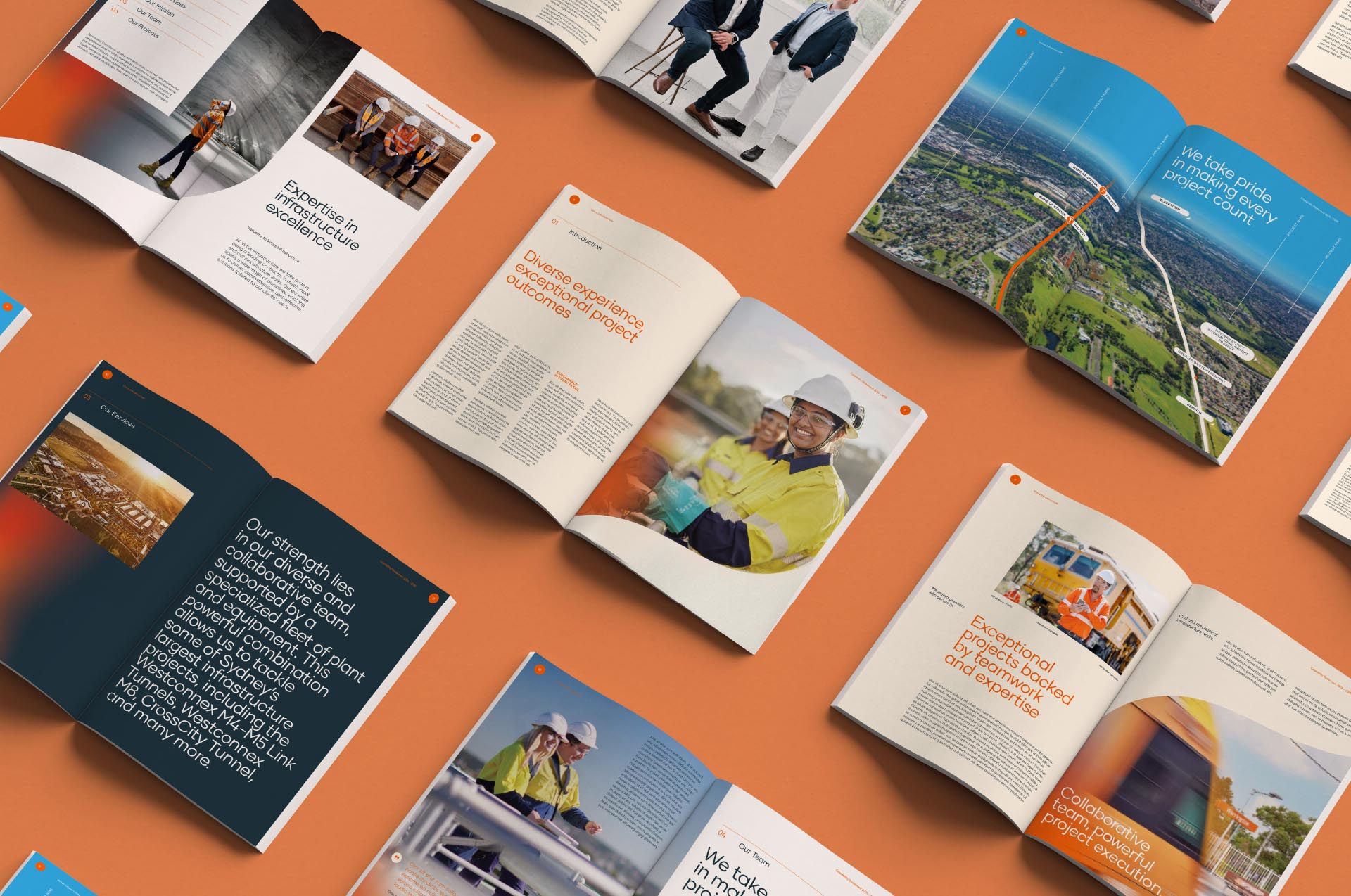
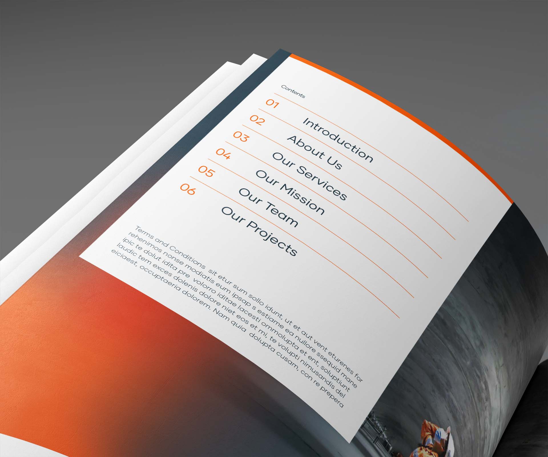
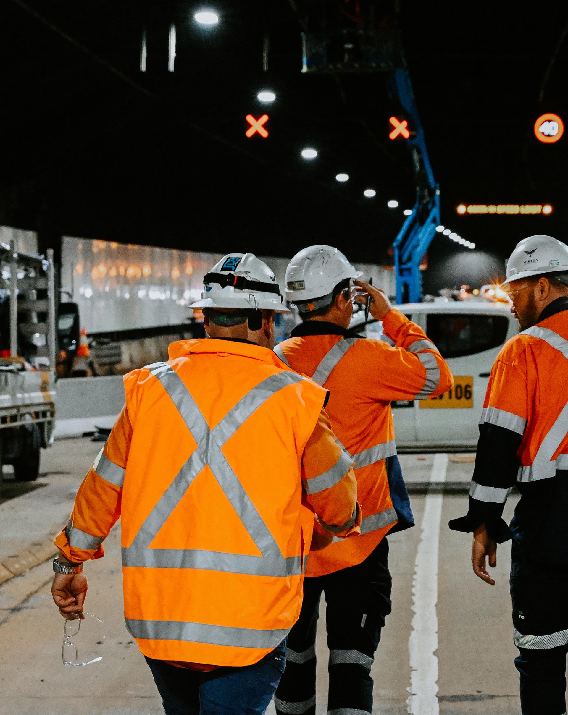
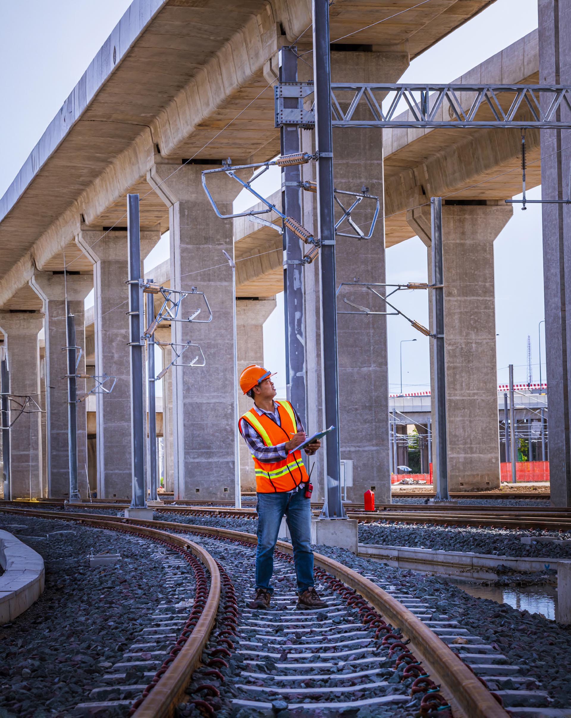
A developed colour palette helped energise the darker project photography typical of a tunnel specialist, while the curved brand device created rhythm and consistency throughout the document. Combined with clean typography, strong graphic hierarchy and a clear content structure, the final piece gave Virtus a clearer identity for major infrastructure opportunities. Further, the content from the capability statement laid the foundation for website design including layout and content, colours and typography.


No items found.

No items found.