


Yeah the boys – bold branding to retain client authenticity.
What we did
Brand Refresh
Illustration
Capability Statement
Industry
Plumbing Specialist
Location
Gold Coast
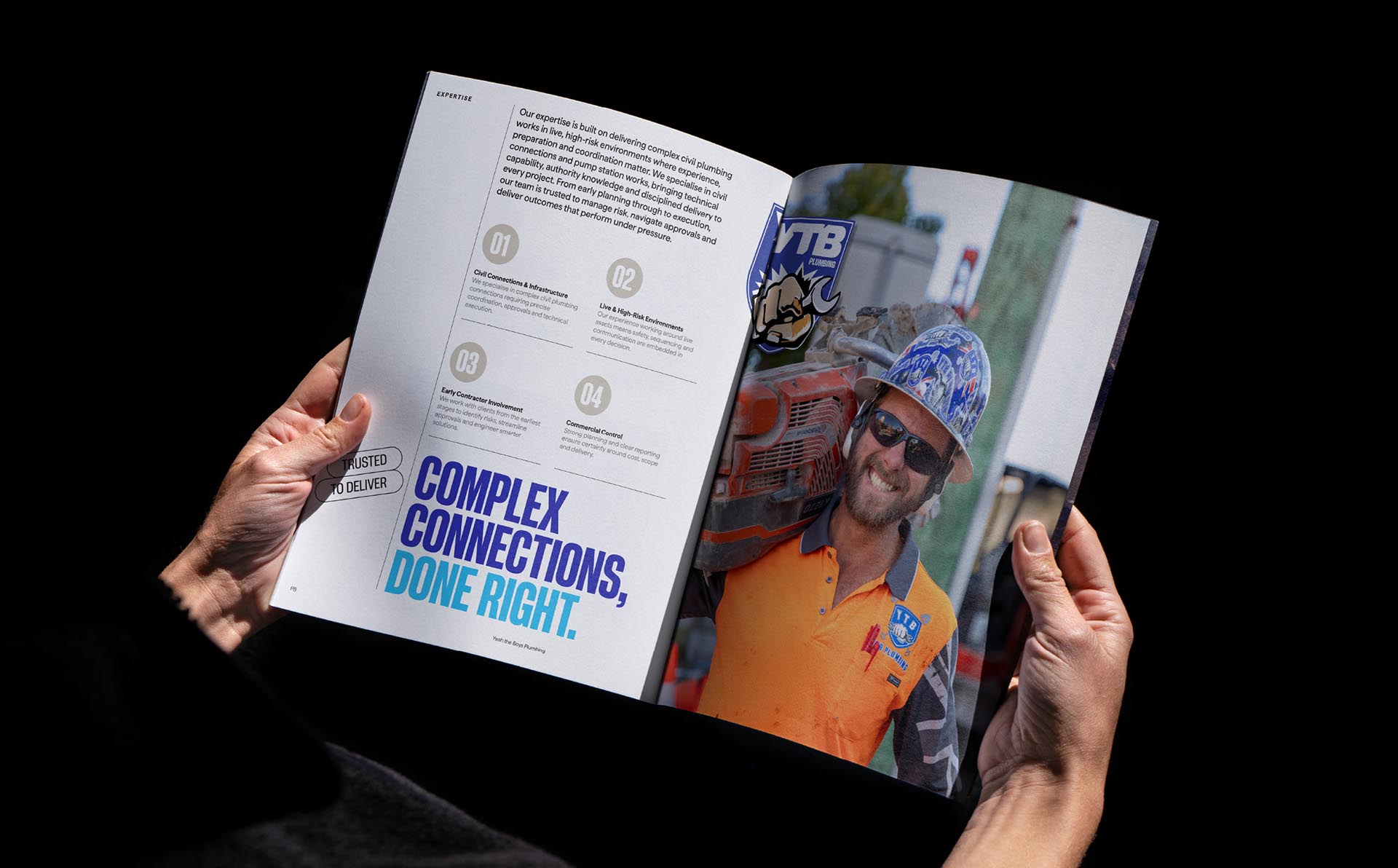
Yeah The Boys was already a business full of personality with a recognisable brand presence on the Gold Coast, built on decommissioned fire trucks and strong community involvement. But beneath the energy, the brand lacked the structure, clarity and polish needed to compete for larger civil and government work. Our team encapsulated everything that made YTB who they were whilst adding polish in both visual language with a series of supporting logos, stronger colour palette, and typography.
2026
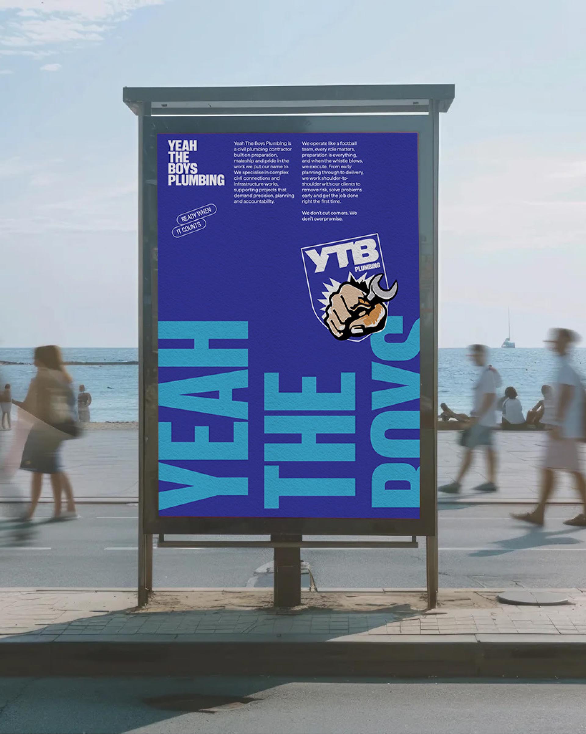
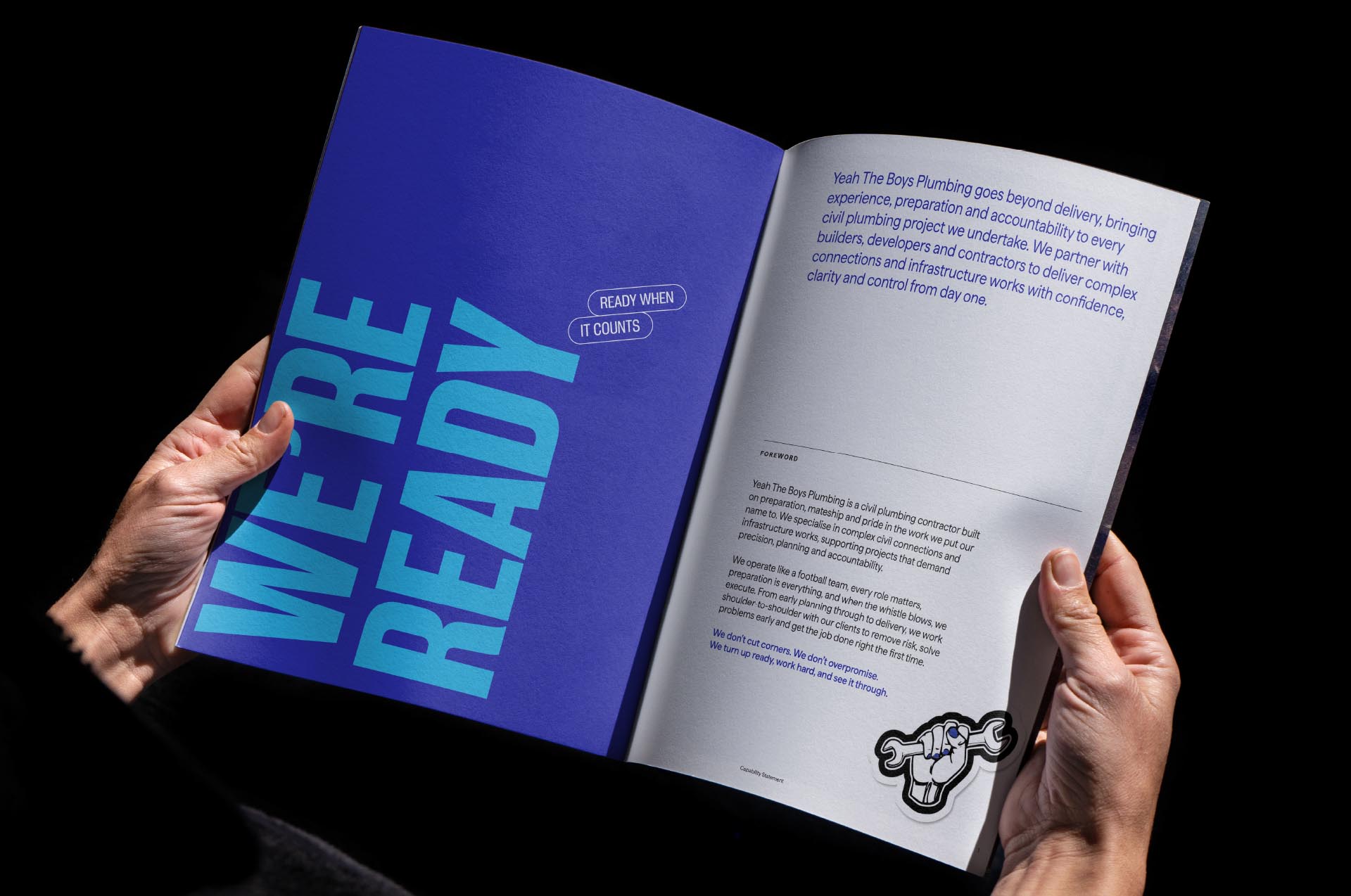
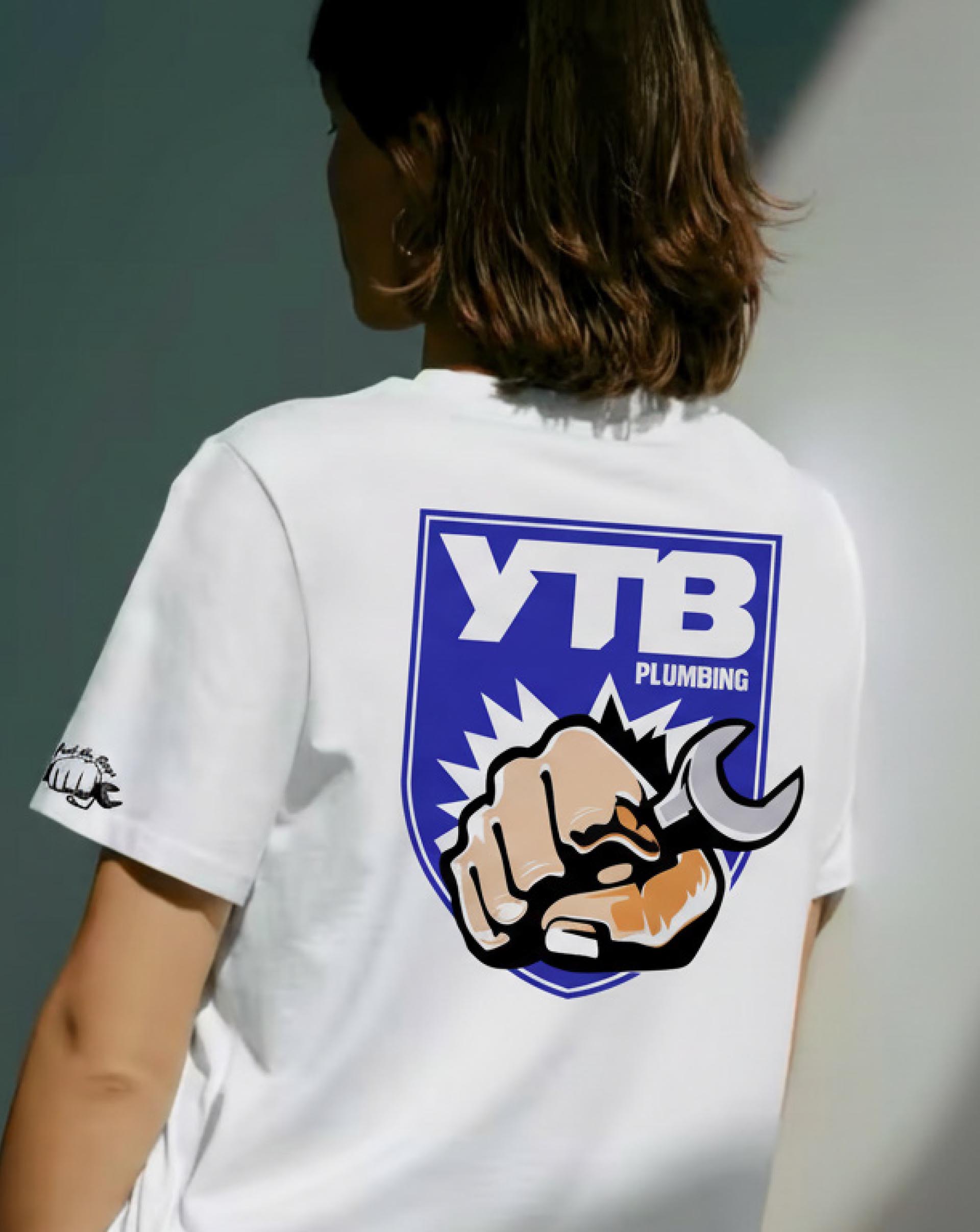
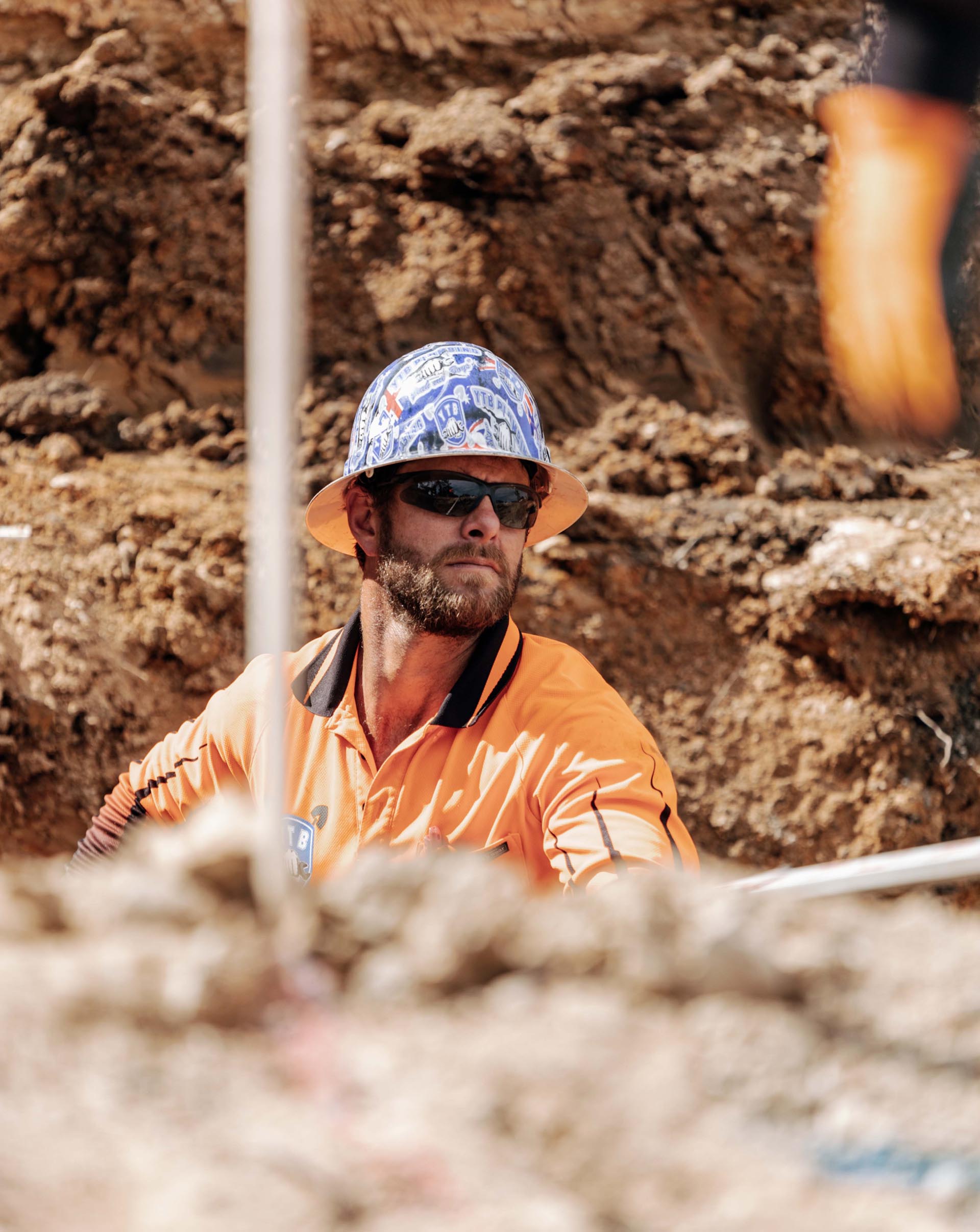
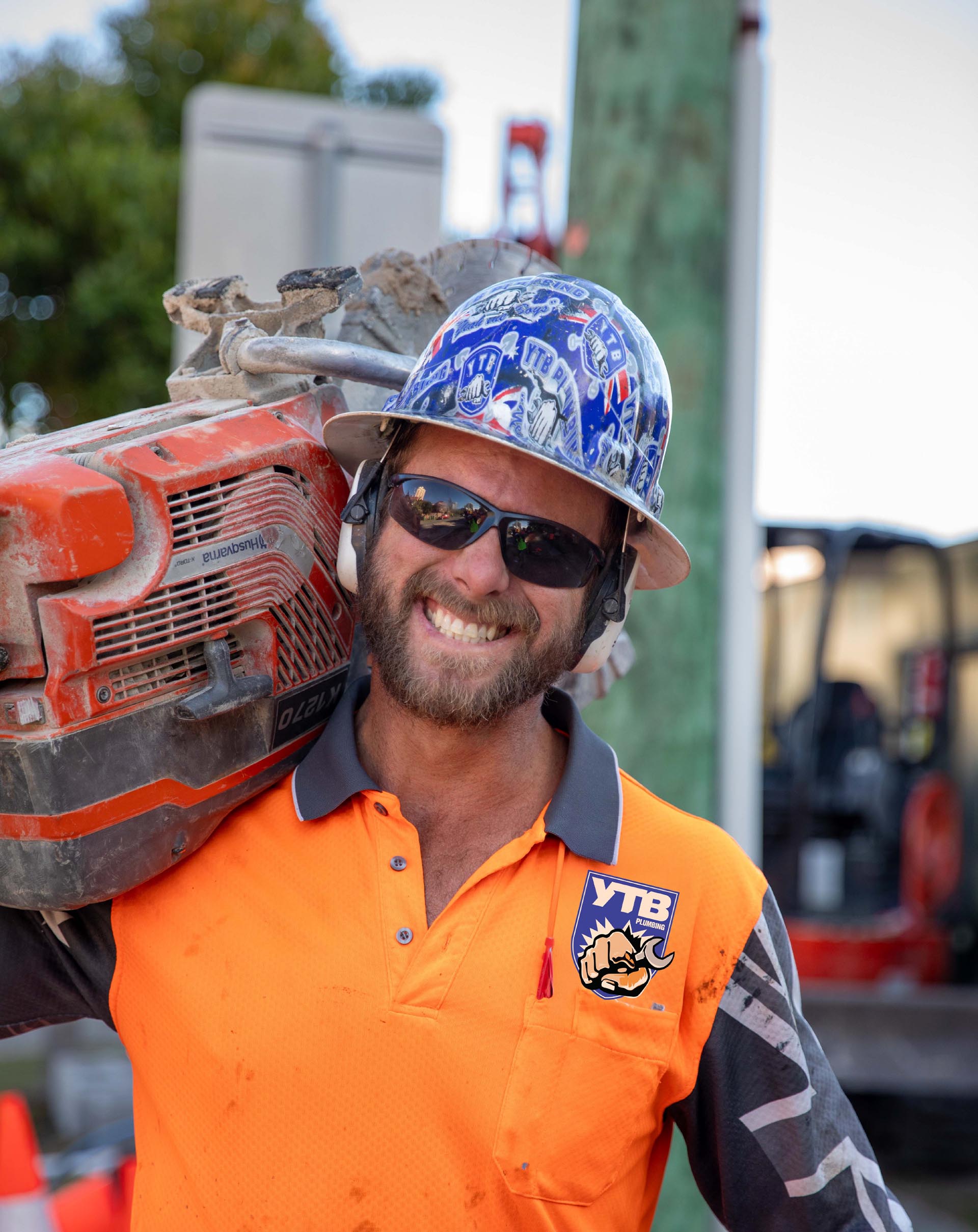
We translated YTB’s winning mentality and team culture into a memorable identity bursting with energy and impact. The brand direction drew on the idea of YTB as a football team: united, competitive and built to win. We refreshed the logo into a stronger, sharper mark with more professional proportions and better scalability, while creating a supporting suite of illustrated badges and stickers that added personality across the document. The refreshed brand extended to bold typography, high-impact imagery and confident layouts with ‘call outs’ in their unique brand language.

No items found.



No items found.